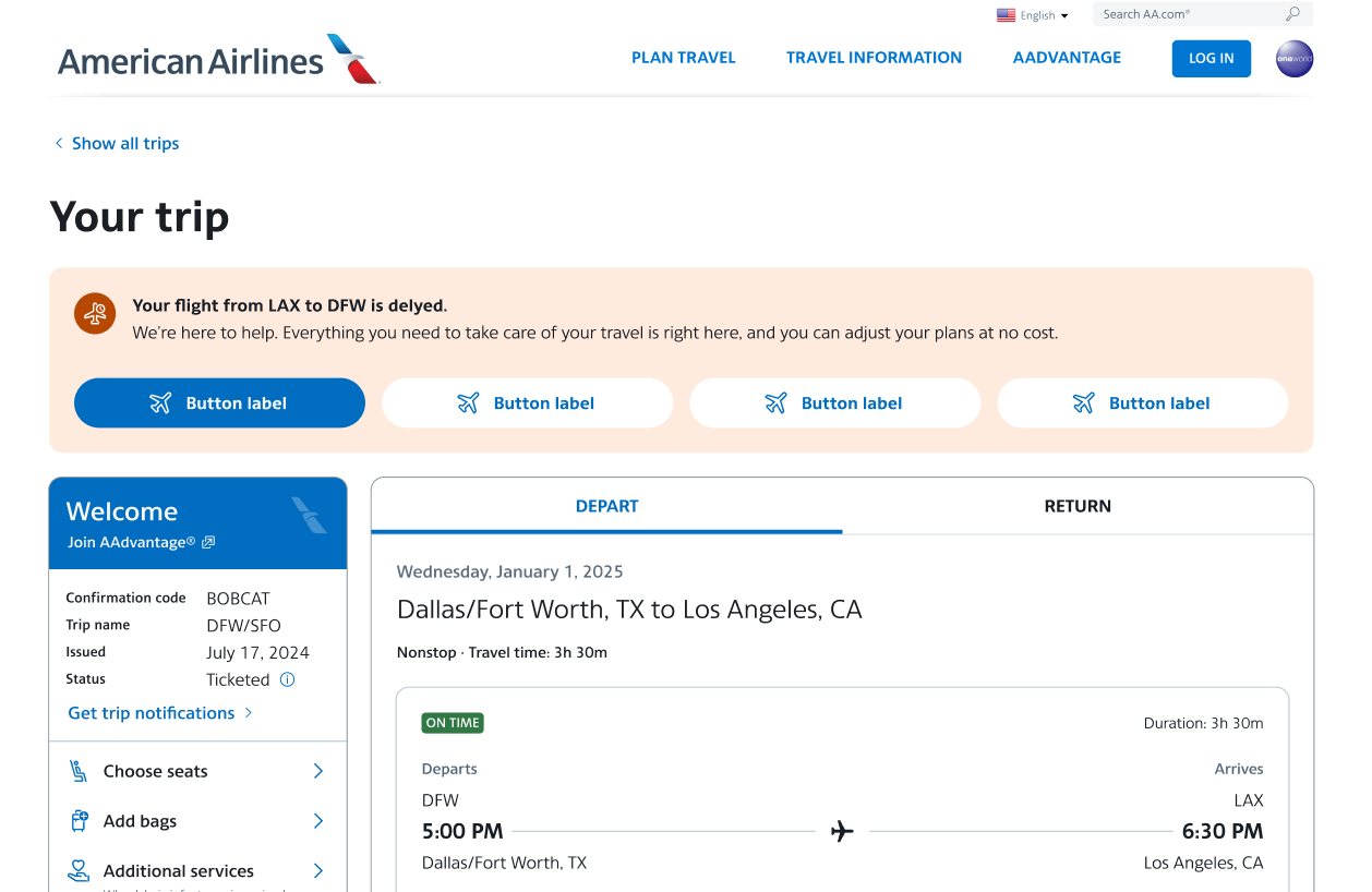
Headliner
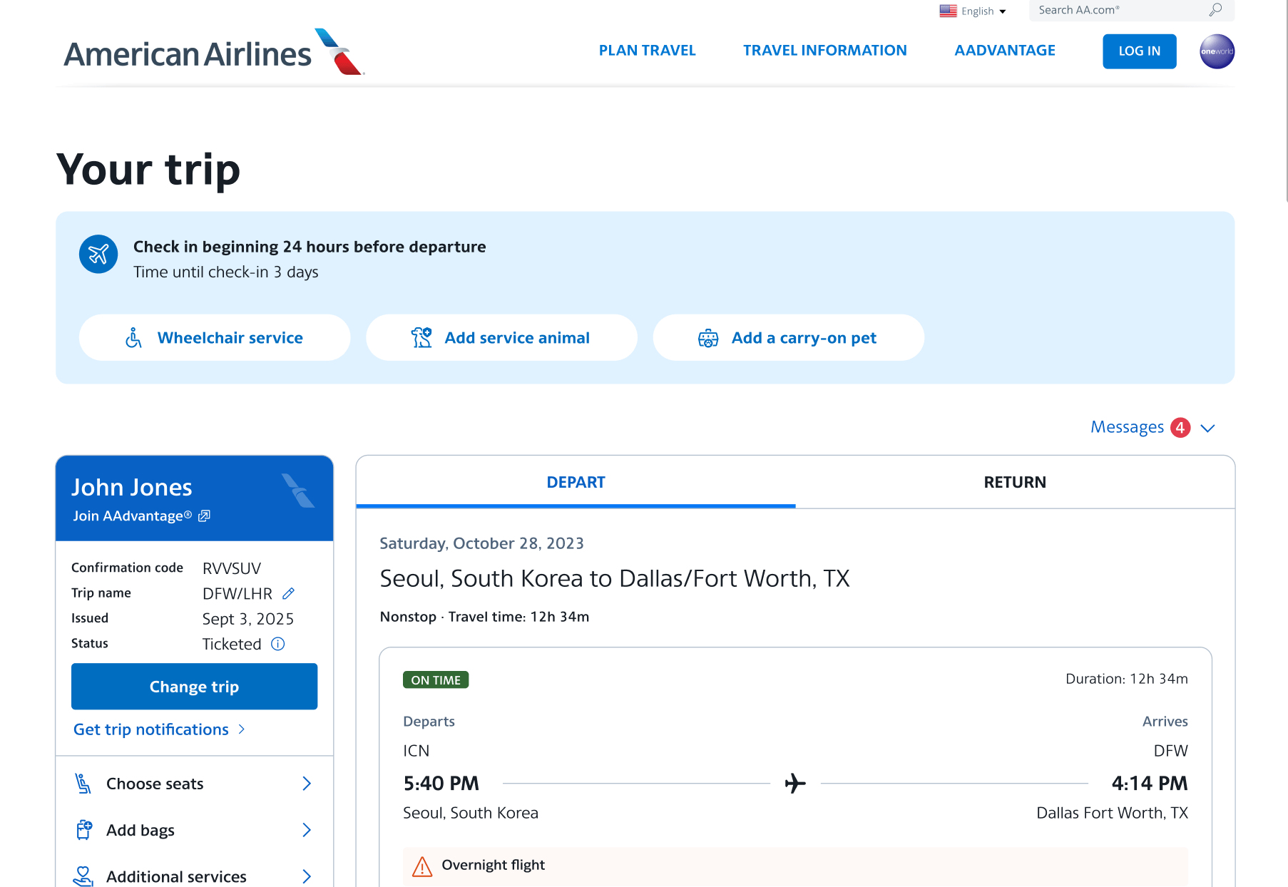
Surfaces the most urgent or contextual information based on where the traveler is in their journey.

In 2021, the Manage Reservation team initiated the View Reservation redesign to help American Airlines customers confidently self‑serve 100% of their trip related needs online. The objective was to reduce reliance on call centers, improve digital Day of Travel clarity, and increase revenue through ancillary sales all while creating an experience travelers could navigate with ease during the most time sensitive moments of their journey.
PRIMARY
Increase self‑service success by addressing key areas where customers were dropping off or calling for help.
SECONDARY
Increase AAdvantage® enrollment by presenting value and benefits at the right moments.
PRIMARY
Improve Day‑of‑Travel clarity by making trip information simple, scannable, and action‑oriented.
SECONDARY
Grow ancillary revenue by making add‑ons and upgrades easier to find and understand.

Through interviews and feedback sessions, we learned that passengers often felt unsure about:
Users repeatedly expressed anxiety around missing a step, misunderstanding a policy, or accidentally making changes they couldn’t reverse.

A scan of other travel and service platforms surfaced a consistent industry trend:
This highlighted an opportunity for us to simplify and standardize the interaction model.
Are you thinking of keywords you should rank for? Are you including links in your text to additional information?
Throughout this redesign, I often guided the team through the natural tension between business priorities and creating the right customer experience. As the organization pushed for revenue outcomes, I helped designers frame conversations around user impact, bring data to the discussion, and collaborate constructively with cross‑functional partners. Sometimes the user experience advanced; sometimes business OKRs took precedence — and I coached the team on how to navigate those trade‑offs thoughtfully and professionally.
A key outcome of this work was the growth of the people involved. One of our junior designers, who led much of the testing, documentation, and validation work, grew significantly in their strategic thinking and communication skills through this project and was promoted to Senior Product Designer as well as Directors award Winner.
This redesign also became one of the first fully data‑driven pages at American Airlines, using analytics, user research, and continuous validation to inform decisions at every step. Despite challenges with platforms, personalities, and delivery pressures, I kept the team aligned, focused, and supported — ensuring we continued to elevate the product while advocating for the customer.
My role in this effort was not just to deliver a better experience, but to strengthen the team, improve cross‑functional collaboration, and embed a more rigorous, insight‑led approach to product design.
Travelers don’t need more information - they need better organized, time relevant information.
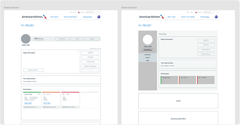
Early wireframes helped us validate hierarchy, content strategy, and placement of key actions like:
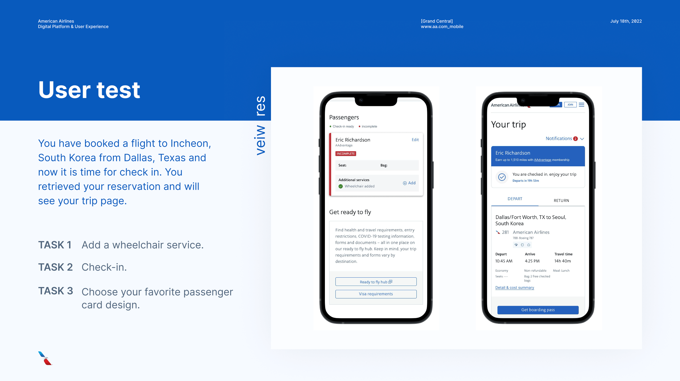
Across multiple rounds of testing with both internal and external users, we continually refined:
Our iterative testing ensured the design aligned with user expectations and reduced the “Am I missing something?” anxiety.
Each feature was designed to directly support a user need or reduce reliance on support channels:
Surfaces the most urgent or contextual information based on where the traveler is in their journey.
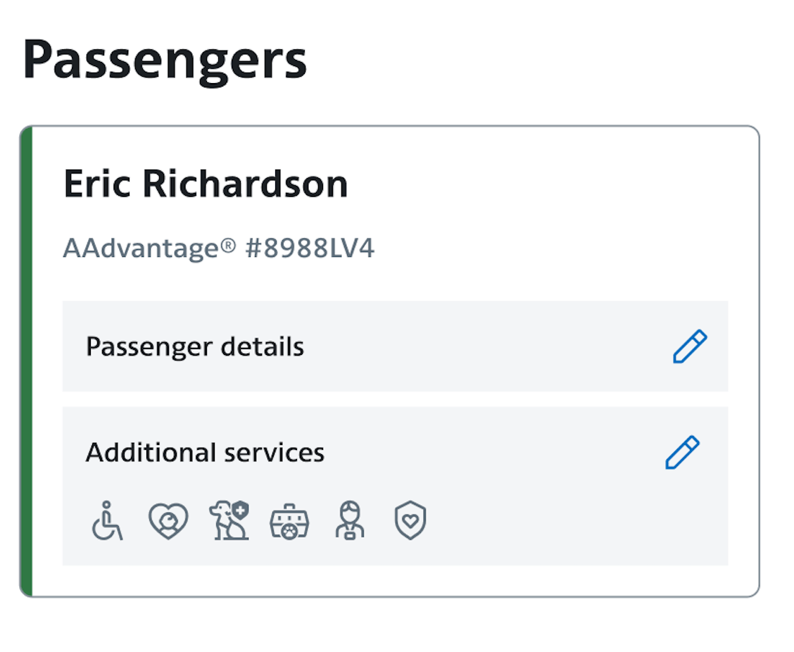
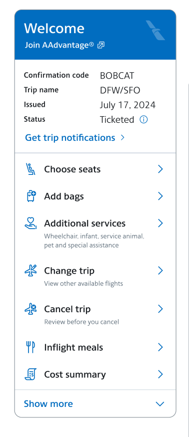
Consolidates traveler‑specific actions like seat selection and upgrades.
Personalizes the experience and clarifies where users are within their trip.
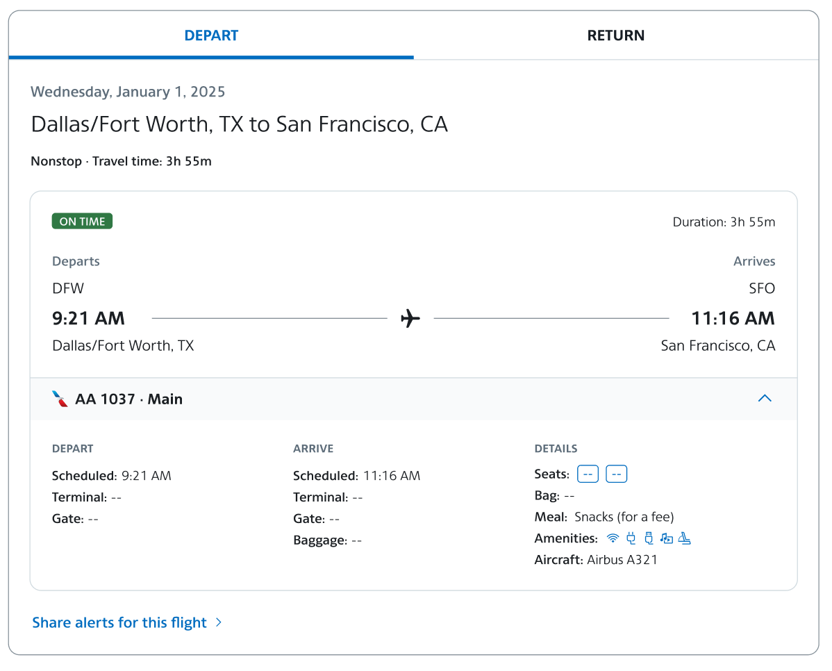
Give a single source of truth across complex itineraries.
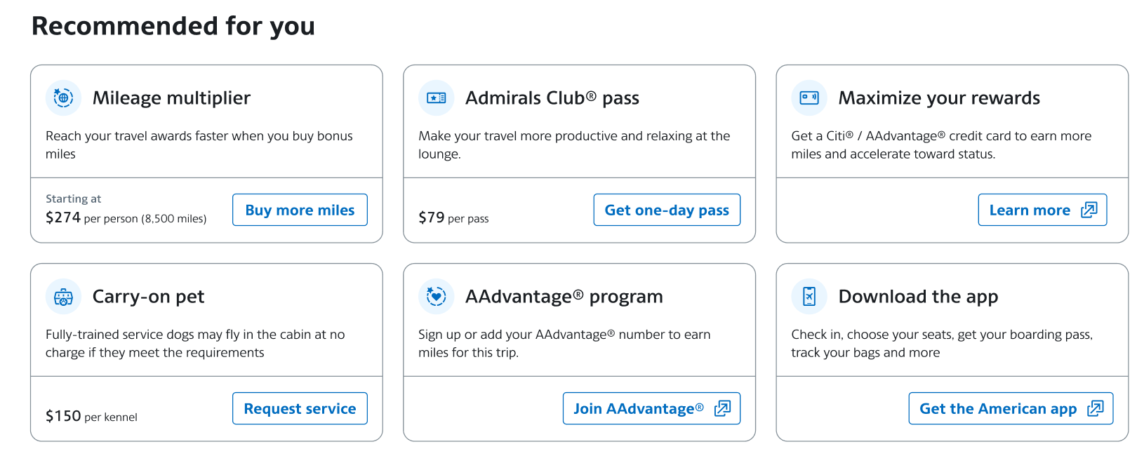
Offer personalized, relevant upsell opportunities without being intrusive.
Equips travelers with real‑time, self‑serve options during irregular operations.
In 2021, the Manage Reservation team initiated the View Reservation redesign to help American Airlines customers confidently self‑serve 100% of their trip related needs online. The objective was to reduce reliance on call centers, improve digital Day of Travel clarity, and increase revenue through ancillary sales all while creating an experience travelers could navigate with ease during the most time sensitive moments of their journey.
Throughout this redesign, I often guided the team through the natural tension between business priorities and creating the right customer experience. As the organization pushed for revenue outcomes, I helped designers frame conversations around user impact, bring data to the discussion, and collaborate constructively with cross‑functional partners. Sometimes the user experience advanced; sometimes business OKRs took precedence — and I coached the team on how to navigate those trade‑offs thoughtfully and professionally.
A key outcome of this work was the growth of the people involved. One of our junior designers, who led much of the testing, documentation, and validation work, grew significantly in their strategic thinking and communication skills through this project and was promoted to Senior Product Designer as well as Directors award Winner.
This redesign also became one of the first fully data‑driven pages at American Airlines, using analytics, user research, and continuous validation to inform decisions at every step. Despite challenges with platforms, personalities, and delivery pressures, I kept the team aligned, focused, and supported — ensuring we continued to elevate the product while advocating for the customer.
My role in this effort was not just to deliver a better experience, but to strengthen the team, improve cross‑functional collaboration, and embed a more rigorous, insight‑led approach to product design.
How might we help passengers more easily understand and manage their trip details so they feel confident and in control throughout their journey?
Through interviews and feedback sessions, we learned that passengers often felt unsure about:
Users repeatedly expressed anxiety around missing a step, misunderstanding a policy, or accidentally making changes they couldn’t reverse.
A scan of other travel and service platforms surfaced a consistent industry trend:
This highlighted an opportunity for us to simplify and standardize the interaction model.
Are you thinking of keywords you should rank for? Are you including links in your text to additional information?
Travelers don’t need more information - they need better organized, time relevant information.
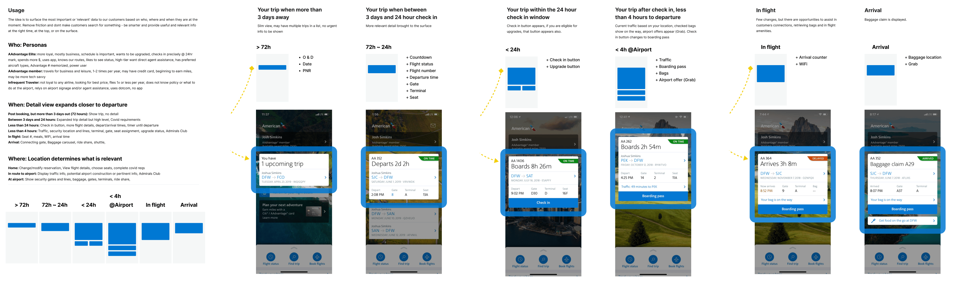
We paired behavioral data with feedback from Customer Care and frontline agents to identify the most valuable redesign opportunities. By mapping user needs to the trip timeline, we learned:
This framing ensured the redesign wasn’t just visually improved but that it was strategically sequenced to support different user mindsets.
Early wireframes helped us validate hierarchy, content strategy, and placement of key actions like:
Across multiple rounds of testing with both internal and external users, we continually refined:
Our iterative testing ensured the design aligned with user expectations and reduced the “Am I missing something?” anxiety.
Give a single source of truth across complex itineraries.
Offer personalized, relevant upsell opportunities without being intrusive.
Equips travelers with real‑time, self‑serve options during irregular operations.
The redesigned View Reservation experience delivered measurable impact in production. These outcomes validate that redesigning for clarity and actionability not only improves experience, it drives business results.
Each feature was designed to directly support a user need or reduce reliance on support channels:
Surfaces the most urgent or contextual information based on where the traveler is in their journey.
Consolidates traveler‑specific actions like seat selection and upgrades.
Personalizes the experience and clarifies where users are within their trip.
In 2021, the Manage Reservation team initiated the View Reservation redesign to help American Airlines customers confidently self‑serve 100% of their trip related needs online. The objective was to reduce reliance on call centers, improve digital Day of Travel clarity, and increase revenue through ancillary sales all while creating an experience travelers could navigate with ease during the most time sensitive moments of their journey.
PRIMARY
Increase self‑service success by addressing key areas where customers were dropping off or calling for help.
SECONDARY
Increase AAdvantage® enrollment by presenting value and benefits at the right moments.
PRIMARY
Improve Day‑of‑Travel clarity by making trip information simple, scannable, and action‑oriented.
SECONDARY
Grow ancillary revenue by making add‑ons and upgrades easier to find and understand.
Throughout this redesign, I often guided the team through the natural tension between business priorities and creating the right customer experience. As the organization pushed for revenue outcomes, I helped designers frame conversations around user impact, bring data to the discussion, and collaborate constructively with cross‑functional partners. Sometimes the user experience advanced; sometimes business OKRs took precedence — and I coached the team on how to navigate those trade‑offs thoughtfully and professionally.
A key outcome of this work was the growth of the people involved. One of our junior designers, who led much of the testing, documentation, and validation work, grew significantly in their strategic thinking and communication skills through this project and was promoted to Senior Product Designer as well as Directors award Winner.
This redesign also became one of the first fully data‑driven pages at American Airlines, using analytics, user research, and continuous validation to inform decisions at every step. Despite challenges with platforms, personalities, and delivery pressures, I kept the team aligned, focused, and supported — ensuring we continued to elevate the product while advocating for the customer.
My role in this effort was not just to deliver a better experience, but to strengthen the team, improve cross‑functional collaboration, and embed a more rigorous, insight‑led approach to product design.
How might we help passengers more easily understand and manage their trip details so they feel confident and in control throughout their journey?
Through interviews and feedback sessions, we learned that passengers often felt unsure about:
Users repeatedly expressed anxiety around missing a step, misunderstanding a policy, or accidentally making changes they couldn’t reverse.
A scan of other travel and service platforms surfaced a consistent industry trend:
This highlighted an opportunity for us to simplify and standardize the interaction model.
Data analysis uncovered three critical signals:
Travelers don’t need more information - they need better organized, time relevant information.
We paired behavioral data with feedback from Customer Care and frontline agents to identify the most valuable redesign opportunities. By mapping user needs to the trip timeline, we learned:
This framing ensured the redesign wasn’t just visually improved but that it was strategically sequenced to support different user mindsets.
Early wireframes helped us validate hierarchy, content strategy, and placement of key actions like:
Across multiple rounds of testing with both internal and external users, we continually refined:
Our iterative testing ensured the design aligned with user expectations and reduced the “Am I missing something?” anxiety.
Each feature was designed to directly support a user need or reduce reliance on support channels:
Surfaces the most urgent or contextual information based on where the traveler is in their journey.
Consolidates traveler‑specific actions like seat selection and upgrades.
Personalizes the experience and clarifies where users are within their trip.
Give a single source of truth across complex itineraries.
Offer personalized, relevant upsell opportunities without being intrusive.
Equips travelers with real‑time, self‑serve options during irregular operations.
The redesigned View Reservation experience delivered measurable impact in production. These outcomes validate that redesigning for clarity and actionability not only improves experience, it drives business results.
Self Service Adoption
7.8%↑
Check in
18.86%↑
Increase Revenue (Add bags)
25.6%↑
Increase Revenue
(Carry on Pet)
340%↑
Increase Revenue
(Instant upsell)
243%↑
Increase Revenue
(Admirals club)
25%↑
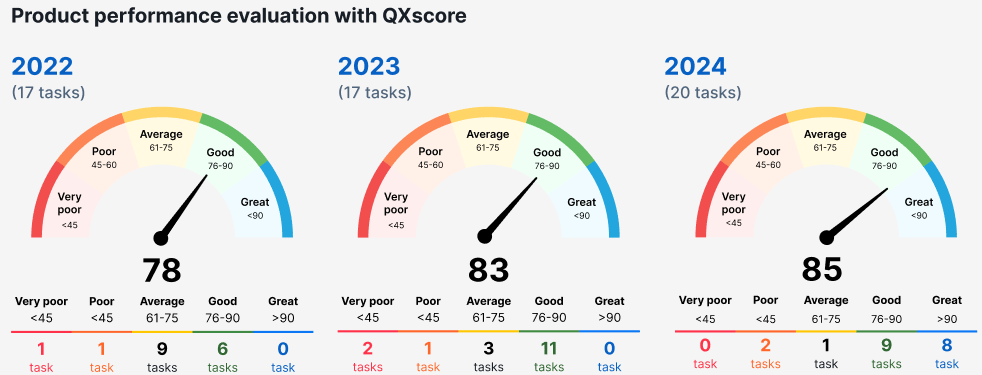
We treated View Reservation as a living product, not a one‑time release. By applying a continuous improvement model informed by QXScore, customer feedback, and emerging operational needs, we delivered updates yearly that further strengthened reliability, clarity, and value.