
Disruption Management initiative
Business Objective
In 2021, the Manage Reservation team initiated the View Reservation redesign to help American Airlines customers confidently self‑serve 100% of their trip related needs online. The objective was to reduce reliance on call centers, improve digital Day of Travel clarity, and increase revenue through ancillary sales all while creating an experience travelers could navigate with ease during the most time sensitive moments of their journey.
PRIMARY
Increase self‑service success by addressing key areas where customers were dropping off or calling for help.
SECONDARY
Increase AAdvantage® enrollment by presenting value and benefits at the right moments.
PRIMARY
Improve Day‑of‑Travel clarity by making trip information simple, scannable, and action‑oriented.
SECONDARY
Grow ancillary revenue by making add‑ons and upgrades easier to find and understand.
Discovery Research
To understand what customers truly needed during stressful situations, we focused on more than the interface — we dug into the emotional, operational, and informational gaps across the entire journey.

Current state
The current state was an alert on Home screen or View Reservation with no action other than an arrow, carrot. We could see through data that this wasn’t grabbing the users attention enough and/or they didn’t know to click on it. This caused a low self service click rate.
Design Thinking Sessions with Agents
We partnered with airport agents and reservation specialists to uncover where inconsistencies emerged. Their firsthand stories revealed moments where customers were overwhelmed, confused, or missing critical context.

Competitive Analysis
We reviewed how other travel and service industries communicated disruptions. Themes quickly surfaced:
- Centralized information
- Clear “next best action”
- Real‑time updates
- Predictable pathways out of the problem
Current Pain Points
(Data driven)
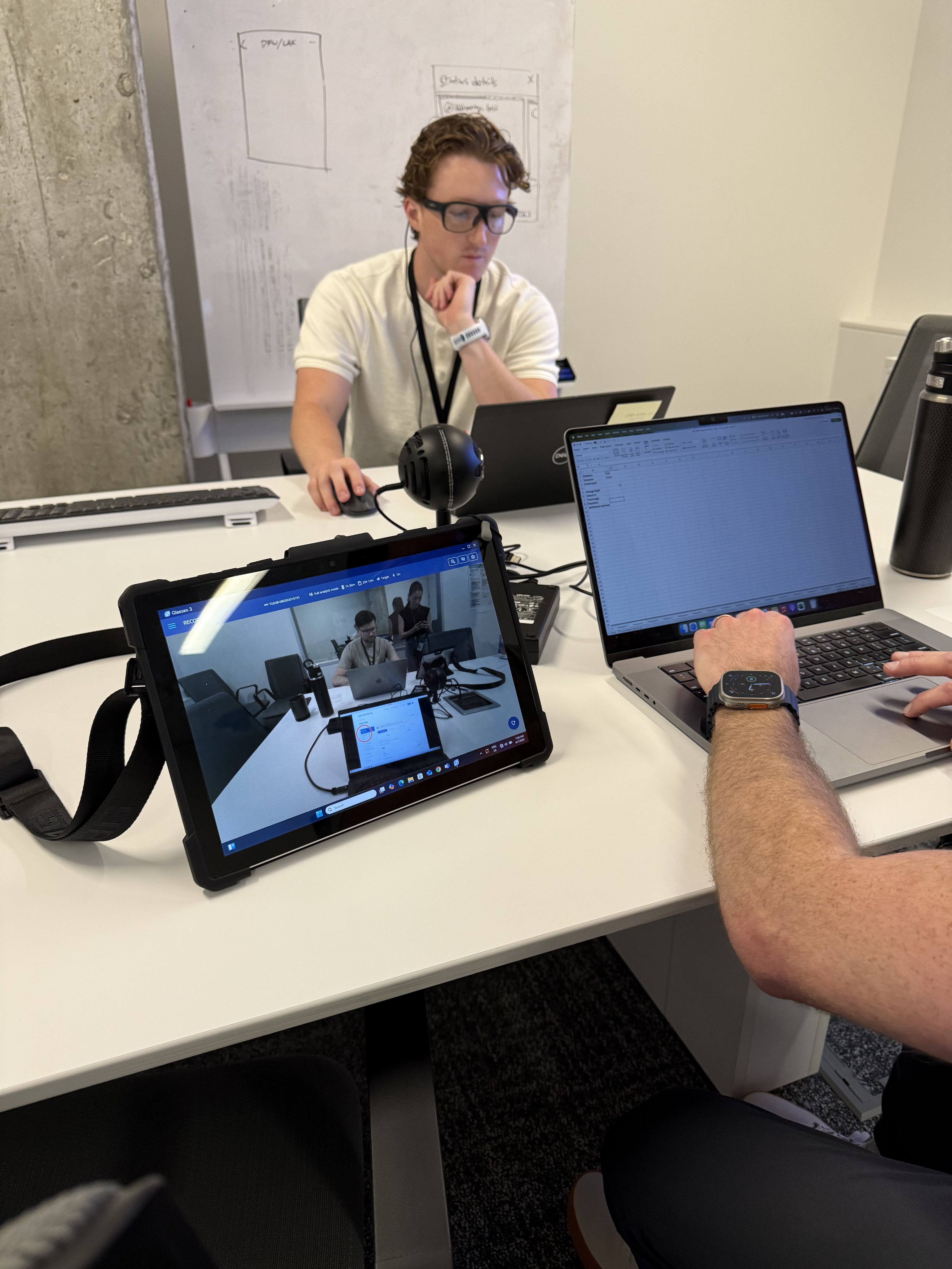
We observed real interactions during disruptions watching how customers asked for help, what information agents repeated, and where physical bottlenecks formed.This gave us:
- A grounded understanding of emotional peaks
- A timeline of pain points
- A strong sense of urgency around misaligned systems
What we learned
Across all research, one message was consistent:Customers and agents were often working with two different truths.
- Agents could see rebooking logic, inventory, and rules customers did not.
- Customers relied on notifications that lacked detail or options.
- The lack of a shared, transparent system created frustration for both groups.
To make disruptions easier, both customers and agents need access to the same information and the same path forward.
Outcomes
This initiative enabled us to launch some of the first truly centralized disruption features the organization had seen.
It aligned multiple portfolios behind a shared customer problem, delivered a more trustworthy experience, and laid the groundwork for scalable disruption management across the entire travel lifecycle. Go live was January 2026; stay tuned for production data.
My Leadership and Strategic Impact
This initiative was a defining leadership moment for me because it required aligning multiple product teams, platforms, and priorities around a single customer experience. Web and App had traditionally worked in silos, so I led the effort to unify problem statements, roadmap sequencing, and experience direction to ensure customers received consistent support regardless of channel. This meant facilitating hard conversations, resolving competing priorities, and building shared ownership across teams.
Mid‑way through the work, we onboarded a new Hyderabad development team and an additional Product Designer. I partnered closely with them to establish global working agreements, shift meeting cadences, and create a healthy cross‑continent collaboration rhythm. This experience strengthened me as a leader and expanded my ability to guide distributed teams with clarity and empathy.
Within my own design team, I supported both a Senior and a Junior Product Designer, intentionally pairing them to balance strengths across research, IA, and high‑fidelity design. I advocated for my Senior Designer by placing him in strategic conversations, coaching him through executive communication, and helping him grow into a broader leadership role. In January 2026, I had the privilege of promoting him to UX Manager, a career milestone that remains one of the proudest outcomes of this initiative.
SECONDARY
Improve operational alignment between airports, digital servicing, and agents.
SECONDARY
Streamline internal tools so frontline teams and customers see consistent information.
SECONDARY
Create an extensible foundation for future disruption‑related products.
Problem Statement
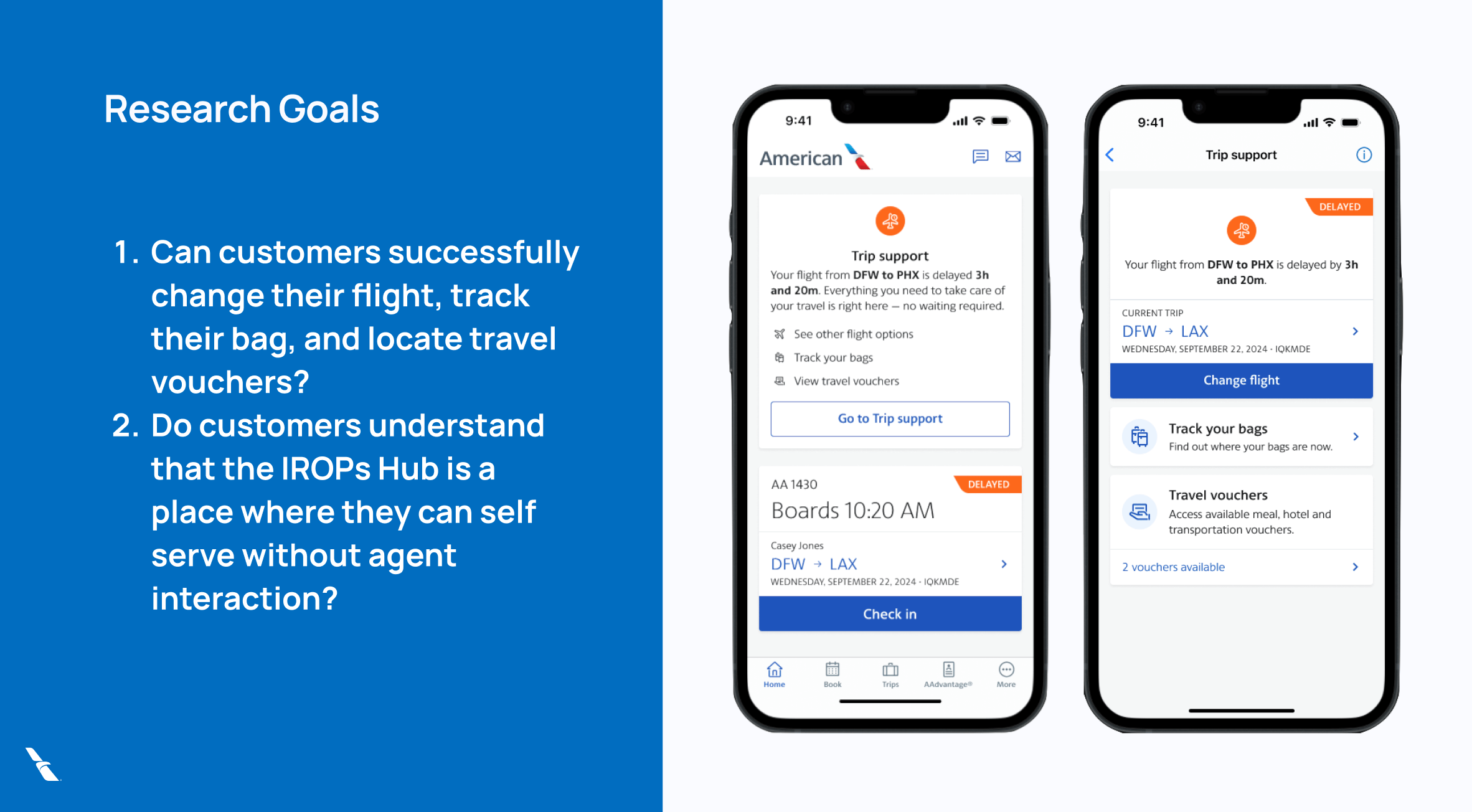
How might we empower customers to quickly understand their situation and resolve disruptions independently through a clear, unified, and transparent digital irregular operations experience?
Service Blueprint
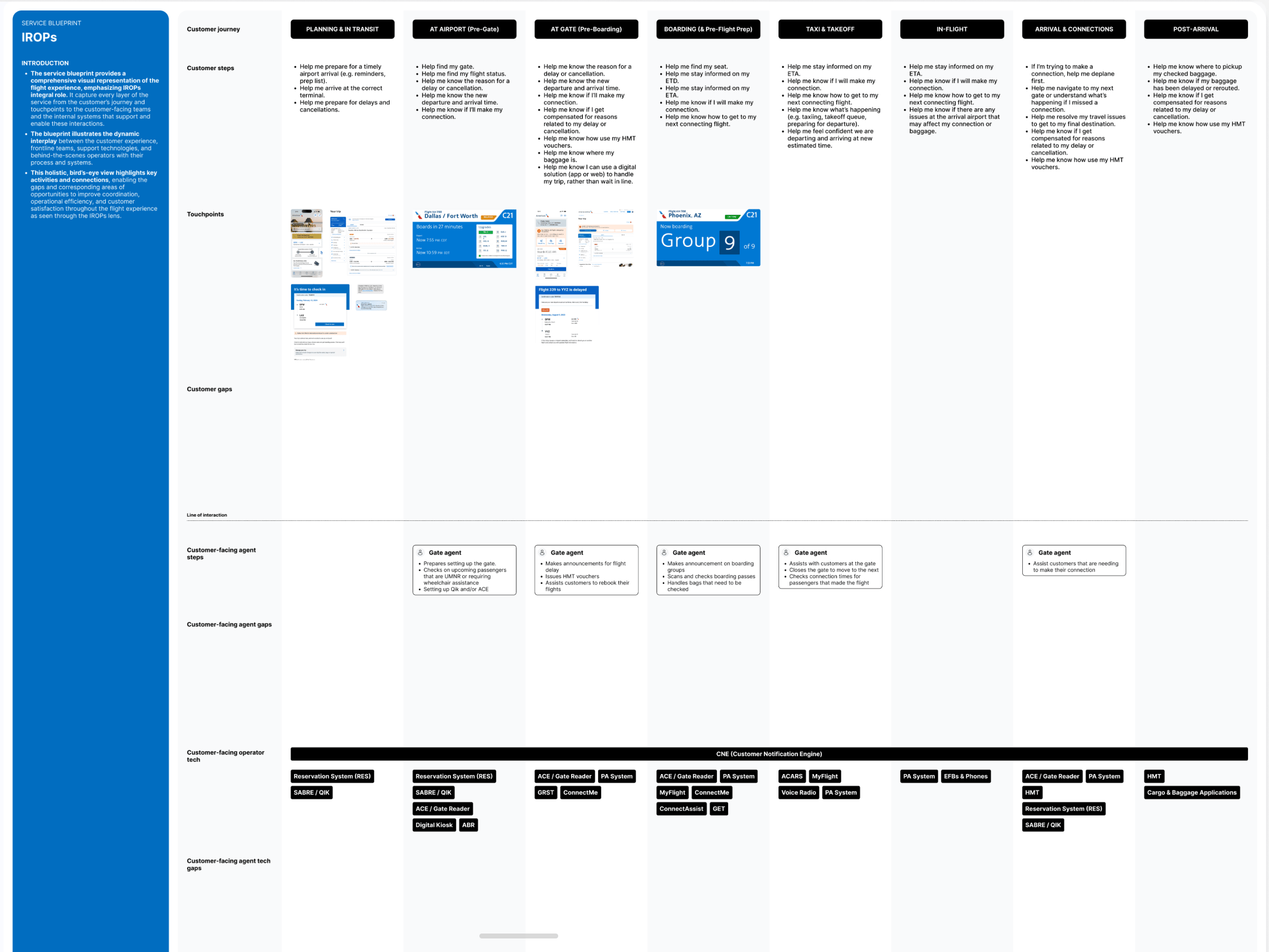
We mapped every touchpoint across digital channels, airport operations, and customer communications. This blueprint visualized where misalignment happened and where UX could lead systemic simplification not just UI improvement.
It became the foundation for a unified, repeatable disruption experience used across portfolios.
Define and Design
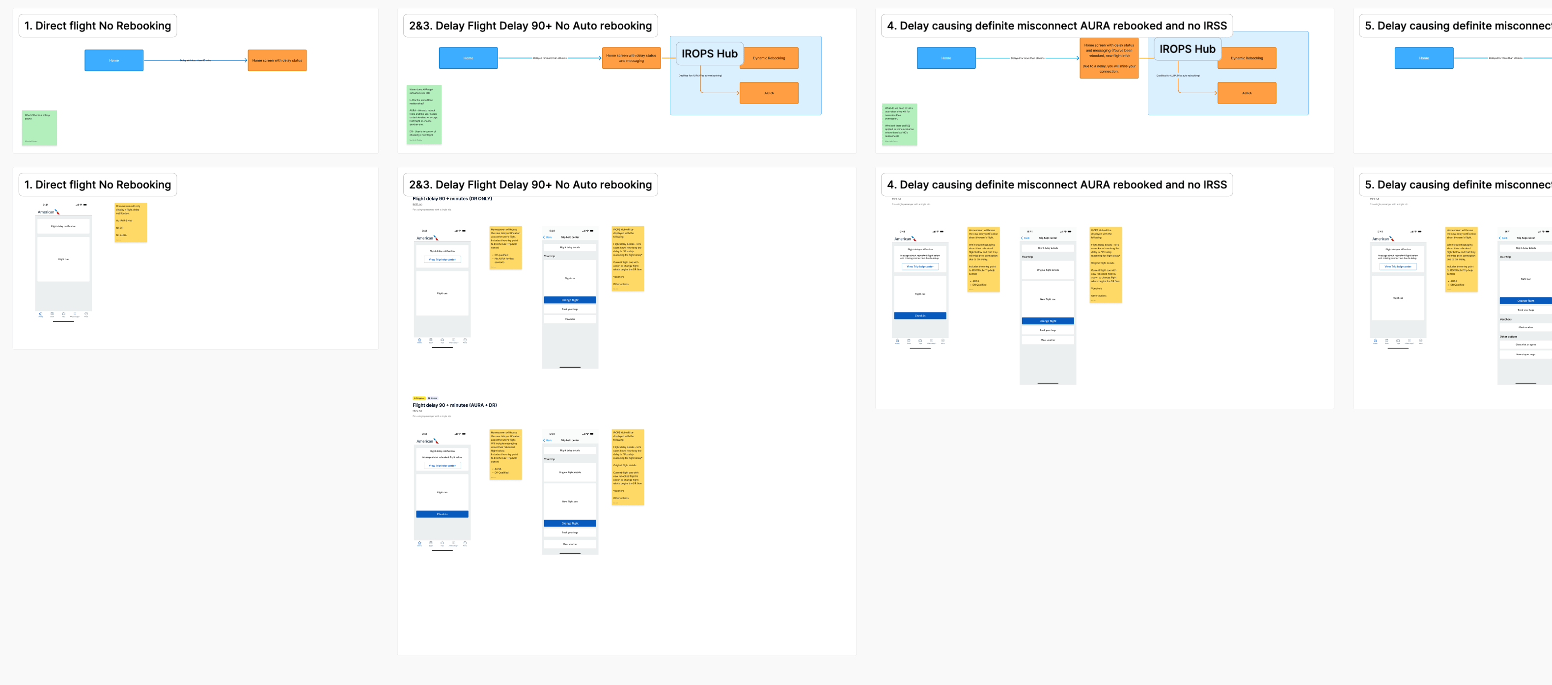
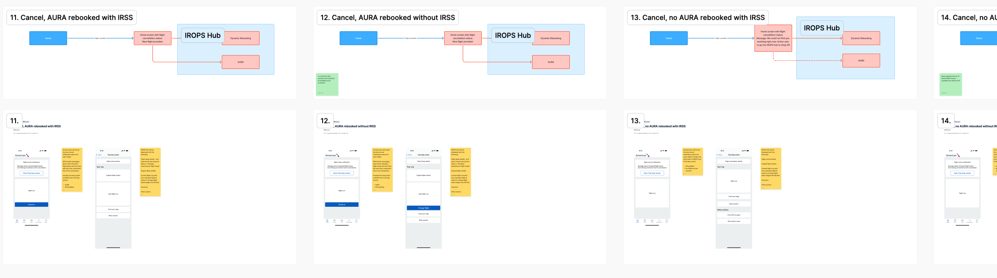
We partnered with Product to define the three core disruption scenarios—delays, cancellations, and misconnects—and aligned on the customer’s key moment, question, and action for each. This clarity allowed us to design streamlined flows that surfaced the right options at the right time.
Our early wireframes focused on transparency and hierarchy, and we quickly moved into interactive prototypes to validate assumptions and refine the experience.
User Testing, early and often
We tested concepts with both customers and agents to validate whether the new structure provided clarity, reduced anxiety, and enabled faster decision‑making.
Each round helped us:
- Refine naming and terminology
- Improve action sequencing
- Adjust messaging for emotional tone
- Simplify option comparisons
This constant loop between research, design, and validation ensured that the customer’s voice stayed at the center of every decision.
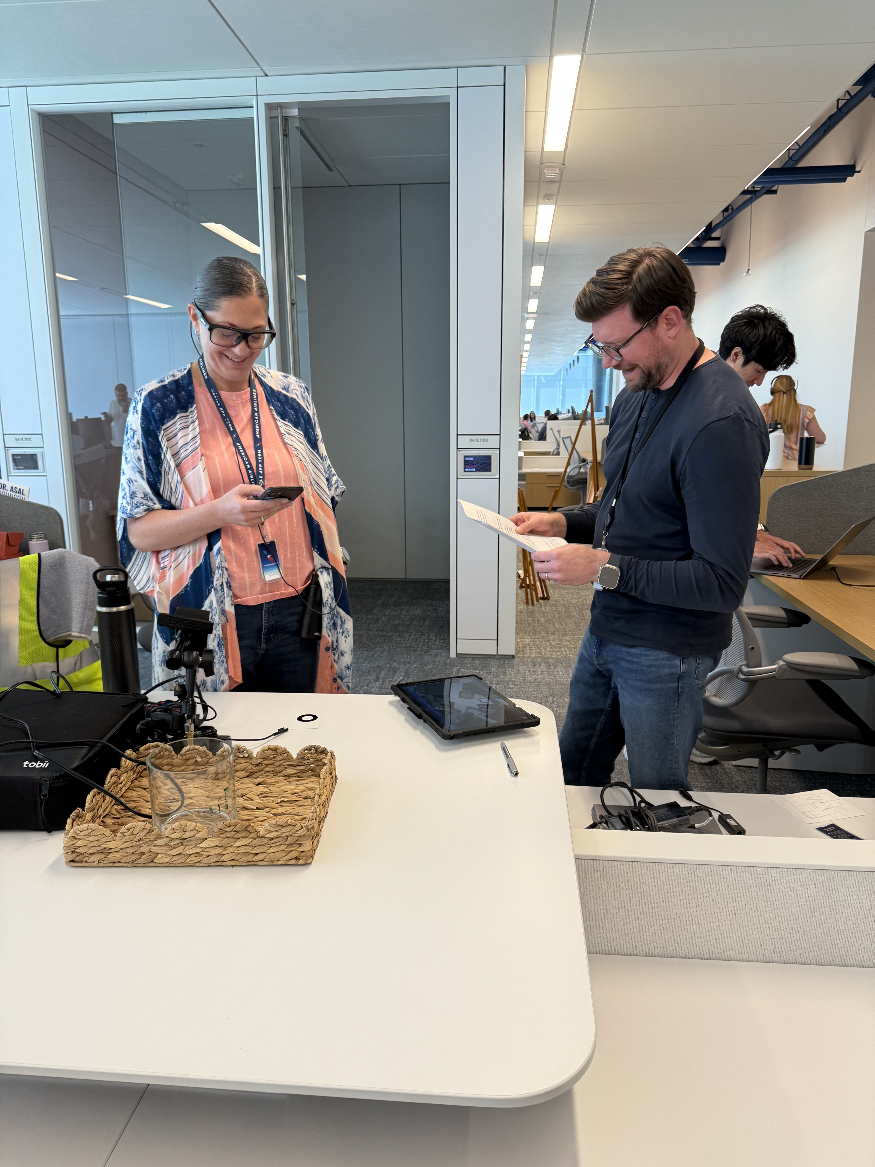
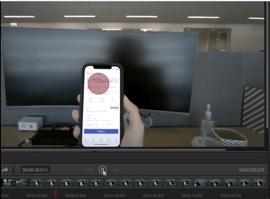
Eye Tracking
Using eye‑tracking studies, we measured where attention fell during stressful decision-making. We found that customers fixated on reassurance cues first (“What happened?”) and actionable next steps second (“What can I do?”).
Features Delivered
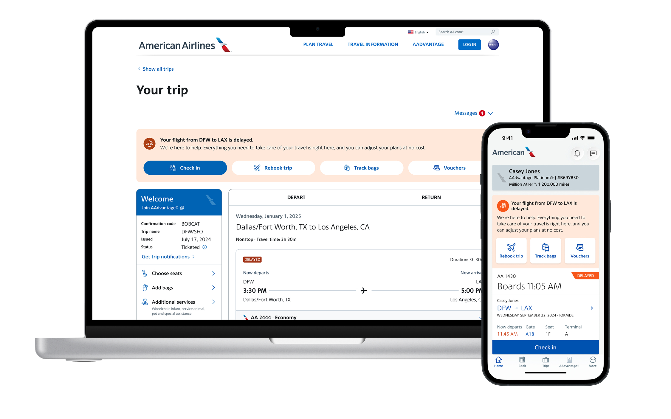
Each feature was designed to directly support a user need or reduce reliance on support channels:
Action Center: Where customers will see dynamic content that allows them to take action during disription
Surfaces the most urgent or contextual information based on where the traveler is in their journey.
Disruption Management initiative
Business Objective
During disruption events, the business aims to centralize all disruption related tools into a single, unified digital hub that gives customers clear, immediate access to essential actions like rebooking, baggage status, and standby options.
By expanding automation and self‑service capabilities, the goal is to reduce reliance on airport agents and reservations while lowering contact ratios and operational costs. At the same time, the initiative focuses on improving customer communication and transparency through real‑time updates, clear delay and eligibility information, and more proactive, intuitive messaging ultimately elevating the customer experience during one of the most stressful points in their journey.
My Leadership and Strategic Impact
This initiative was a defining leadership moment for me because it required aligning multiple product teams, platforms, and priorities around a single customer experience. Web and App had traditionally worked in silos, so I led the effort to unify problem statements, roadmap sequencing, and experience direction to ensure customers received consistent support regardless of channel. This meant facilitating hard conversations, resolving competing priorities, and building shared ownership across teams.
Mid‑way through the work, we onboarded a new Hyderabad development team and an additional Product Designer. I partnered closely with them to establish global working agreements, shift meeting cadences, and create a healthy cross‑continent collaboration rhythm. This experience strengthened me as a leader and expanded my ability to guide distributed teams with clarity and empathy.
Within my own design team, I supported both a Senior and a Junior Product Designer, intentionally pairing them to balance strengths across research, IA, and high‑fidelity design. I advocated for my Senior Designer by placing him in strategic conversations, coaching him through executive communication, and helping him grow into a broader leadership role. In January 2026, I had the privilege of promoting him to UX Manager, a career milestone that remains one of the proudest outcomes of this initiative.
Discovery Research
To understand what customers truly needed during stressful situations, we focused on more than the interface — we dug into the emotional, operational, and informational gaps across the entire journey.
Current state
The current state was an alert on Home screen or View Reservation with no action other than an arrow, carrot. We could see through data that this wasn’t grabbing the users attention enough and/or they didn’t know to click on it. This caused a low self service click rate.
Design Thinking Sessions with Agents
We partnered with airport agents and reservation specialists to uncover where inconsistencies emerged. Their firsthand stories revealed moments where customers were overwhelmed, confused, or missing critical context.
Competitive Analysis
We reviewed how other travel and service industries communicated disruptions. Themes quickly surfaced:
- Centralized information
- Clear “next best action”
- Real‑time updates
- Predictable pathways out of the problem
Field Research and Airport Shadowing
We observed real interactions during disruptions watching how customers asked for help, what information agents repeated, and where physical bottlenecks formed.This gave us:
- A grounded understanding of emotional peaks
- A timeline of pain points
- A strong sense of urgency around misaligned systems
What we learned
Across all research, one message was consistent:Customers and agents were often working with two different truths.
- Agents could see rebooking logic, inventory, and rules customers did not.
- Customers relied on notifications that lacked detail or options.
- The lack of a shared, transparent system created frustration for both groups.
To make disruptions easier, both customers and agents need access to the same information and the same path forward.
Service Blueprint
We mapped every touchpoint across digital channels, airport operations, and customer communications. This blueprint visualized where misalignment happened and where UX could lead systemic simplification not just UI improvement.
It became the foundation for a unified, repeatable disruption experience used across portfolios.
Define and Design
We partnered with Product to define the three core disruption scenarios—delays, cancellations, and misconnects—and aligned on the customer’s key moment, question, and action for each. This clarity allowed us to design streamlined flows that surfaced the right options at the right time.
Our early wireframes focused on transparency and hierarchy, and we quickly moved into interactive prototypes to validate assumptions and refine the experience.
User Testing, early and often
We tested concepts with both customers and agents to validate whether the new structure provided clarity, reduced anxiety, and enabled faster decision‑making.
Each round helped us:
- Refine naming and terminology
- Improve action sequencing
- Adjust messaging for emotional tone
- Simplify option comparisons
This constant loop between research, design, and validation ensured that the customer’s voice stayed at the center of every decision.
Eye Tracking
Using eye‑tracking studies, we measured where attention fell during stressful decision-making. We found that customers fixated on reassurance cues first (“What happened?”) and actionable next steps second (“What can I do?”).
Features Delivered
Each feature was designed to directly support a user need or reduce reliance on support channels:
Action Center: Where customers will see dynamic content that allows them to take action during disription
Surfaces the most urgent or contextual information based on where the traveler is in their journey.
Outcomes
This initiative enabled us to launch some of the first truly centralized disruption features the organization had seen.
It aligned multiple portfolios behind a shared customer problem, delivered a more trustworthy experience, and laid the groundwork for scalable disruption management across the entire travel lifecycle. Go live was January 2026; stay tuned for production data.
See it in the news!
Disruption Management initiative
Business Objective
During disruption events, the business aims to centralize all disruption related tools into a single, unified digital hub that gives customers clear, immediate access to essential actions like rebooking, baggage status, and standby options.
By expanding automation and self‑service capabilities, the goal is to reduce reliance on airport agents and reservations while lowering contact ratios and operational costs. At the same time, the initiative focuses on improving customer communication and transparency through real‑time updates, clear delay and eligibility information, and more proactive, intuitive messaging ultimately elevating the customer experience during one of the most stressful points in their journey.
PRIMARY
Increase customer autonomy by surfacing relevant options (rebooking, hotel, meals, etc.).
PRIMARY
Reduce call volume by simplifying next‑step decision making.
PRIMARY
Improve Day‑of‑Travel clarity using timely, contextual information.
SECONDARY
Improve operational alignment between airports, digital servicing, and agents.
SECONDARY
Streamline internal tools so frontline teams and customers see consistent information.
SECONDARY
Create an extensible foundation for future disruption‑related products.
My Leadership and Strategic Impact
This initiative was a defining leadership moment for me because it required aligning multiple product teams, platforms, and priorities around a single customer experience. Web and App had traditionally worked in silos, so I led the effort to unify problem statements, roadmap sequencing, and experience direction to ensure customers received consistent support regardless of channel. This meant facilitating hard conversations, resolving competing priorities, and building shared ownership across teams.
Mid‑way through the work, we onboarded a new Hyderabad development team and an additional Product Designer. I partnered closely with them to establish global working agreements, shift meeting cadences, and create a healthy cross‑continent collaboration rhythm. This experience strengthened me as a leader and expanded my ability to guide distributed teams with clarity and empathy.
Within my own design team, I supported both a Senior and a Junior Product Designer, intentionally pairing them to balance strengths across research, IA, and high‑fidelity design. I advocated for my Senior Designer by placing him in strategic conversations, coaching him through executive communication, and helping him grow into a broader leadership role. In January 2026, I had the privilege of promoting him to UX Manager, a career milestone that remains one of the proudest outcomes of this initiative.
Problem Statement
How might we empower customers to quickly understand their situation and resolve disruptions independently through a clear, unified, and transparent digital irregular operations experience?
Discovery Research
To understand what customers truly needed during stressful situations, we focused on more than the interface — we dug into the emotional, operational, and informational gaps across the entire journey.
Current state
The current state was an alert on Home screen or View Reservation with no action other than an arrow, carrot. We could see through data that this wasn’t grabbing the users attention enough and/or they didn’t know to click on it. This caused a low self service click rate.
Design Thinking Sessions with Agents
We partnered with airport agents and reservation specialists to uncover where inconsistencies emerged. Their firsthand stories revealed moments where customers were overwhelmed, confused, or missing critical context.
Competitive Analysis
We reviewed how other travel and service industries communicated disruptions. Themes quickly surfaced:
- Centralized information
- Clear “next best action”
- Real‑time updates
- Predictable pathways out of the problem
Field Research and Airport Shadowing
We observed real interactions during disruptions watching how customers asked for help, what information agents repeated, and where physical bottlenecks formed.This gave us:
- A grounded understanding of emotional peaks
- A timeline of pain points
- A strong sense of urgency around misaligned systems
What we learned
Across all research, one message was consistent:Customers and agents were often working with two different truths.
- Agents could see rebooking logic, inventory, and rules customers did not.
- Customers relied on notifications that lacked detail or options.
- The lack of a shared, transparent system created frustration for both groups.
To make disruptions easier, both customers and agents need access to the same information and the same path forward.
Service Blueprint
We mapped every touchpoint across digital channels, airport operations, and customer communications. This blueprint visualized where misalignment happened and where UX could lead systemic simplification not just UI improvement.
It became the foundation for a unified, repeatable disruption experience used across portfolios.
Define and Design
We partnered with Product to define the three core disruption scenarios—delays, cancellations, and misconnects—and aligned on the customer’s key moment, question, and action for each. This clarity allowed us to design streamlined flows that surfaced the right options at the right time.
Our early wireframes focused on transparency and hierarchy, and we quickly moved into interactive prototypes to validate assumptions and refine the experience.
User Testing, early and often
We tested concepts with both customers and agents to validate whether the new structure provided clarity, reduced anxiety, and enabled faster decision‑making.
Each round helped us:
- Refine naming and terminology
- Improve action sequencing
- Adjust messaging for emotional tone
- Simplify option comparisons
This constant loop between research, design, and validation ensured that the customer’s voice stayed at the center of every decision.
Eye Tracking
Using eye‑tracking studies, we measured where attention fell during stressful decision-making. We found that customers fixated on reassurance cues first (“What happened?”) and actionable next steps second (“What can I do?”).
Features Delivered
Each feature was designed to directly support a user need or reduce reliance on support channels:
Action Center: Where customers will see dynamic content that allows them to take action during disription
Surfaces the most urgent or contextual information based on where the traveler is in their journey.
Outcomes
This initiative enabled us to launch some of the first truly centralized disruption features the organization had seen.
It aligned multiple portfolios behind a shared customer problem, delivered a more trustworthy experience, and laid the groundwork for scalable disruption management across the entire travel lifecycle. Go live was January 2026; stay tuned for production data.
See it in the news!