
LAX Digital Signage Redesign
Business Objective
In 2021, the Manage Reservation team initiated the View Reservation redesign to help American Airlines customers confidently self‑serve 100% of their trip related needs online. The objective was to reduce reliance on call centers, improve digital Day of Travel clarity, and increase revenue through ancillary sales all while creating an experience travelers could navigate with ease during the most time sensitive moments of their journey.
LAX Digital Wayfinding
American Airlines is updating and modernizing the digital signs at Los Angeles International Airport (LAX). These signs help travelers find their way, check their bags, and understand where to go in the terminal.
Several things triggered the redesign:
- Construction at LAX caused outdated or incorrect signage.
- New technology required updated designs.
- Improving the traveler experience is a major focus across the company.
Competitive Analysis
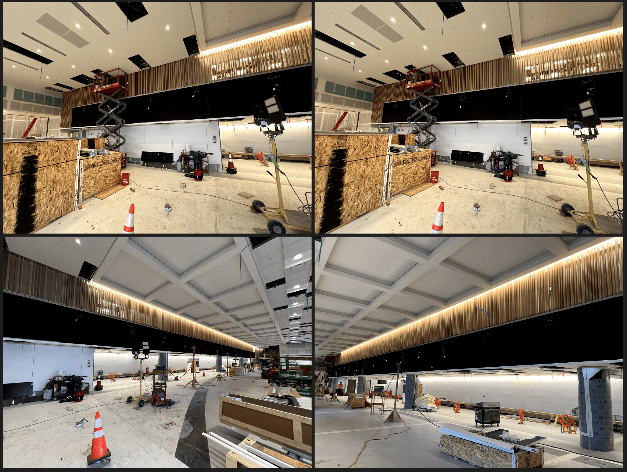
Once we walked through the current construction to understand the space, we also did a competitive analysis while at LAX to understand what other leader int he airline were doing.
Working closely with Airport Operations + LAX + Brand
This work is a true cross‑team effort involving UX Designers, Airport Technology & Digital Signage teams, Airport Operations, and our partners at LAX. Because airport signage sits at the intersection of customer experience, local station needs, and regulatory constraints, no single team can solve it alone.
To redesign LAX’s digital signage, we worked closely with both LAX Airport leadership and our Marketing/Brand team to strike the right balance between local requirements and American’s system‑wide brand identity. LAX had clear operational goals—improving passenger flow, reducing confusion during construction, and simplifying the check‑in experience. At the same time, our Marketing partners ensured that every visual, message, color, and icon aligned with AA’s broader brand guidelines so travelers experience consistency no matter which airport they’re in.
Wayfinding
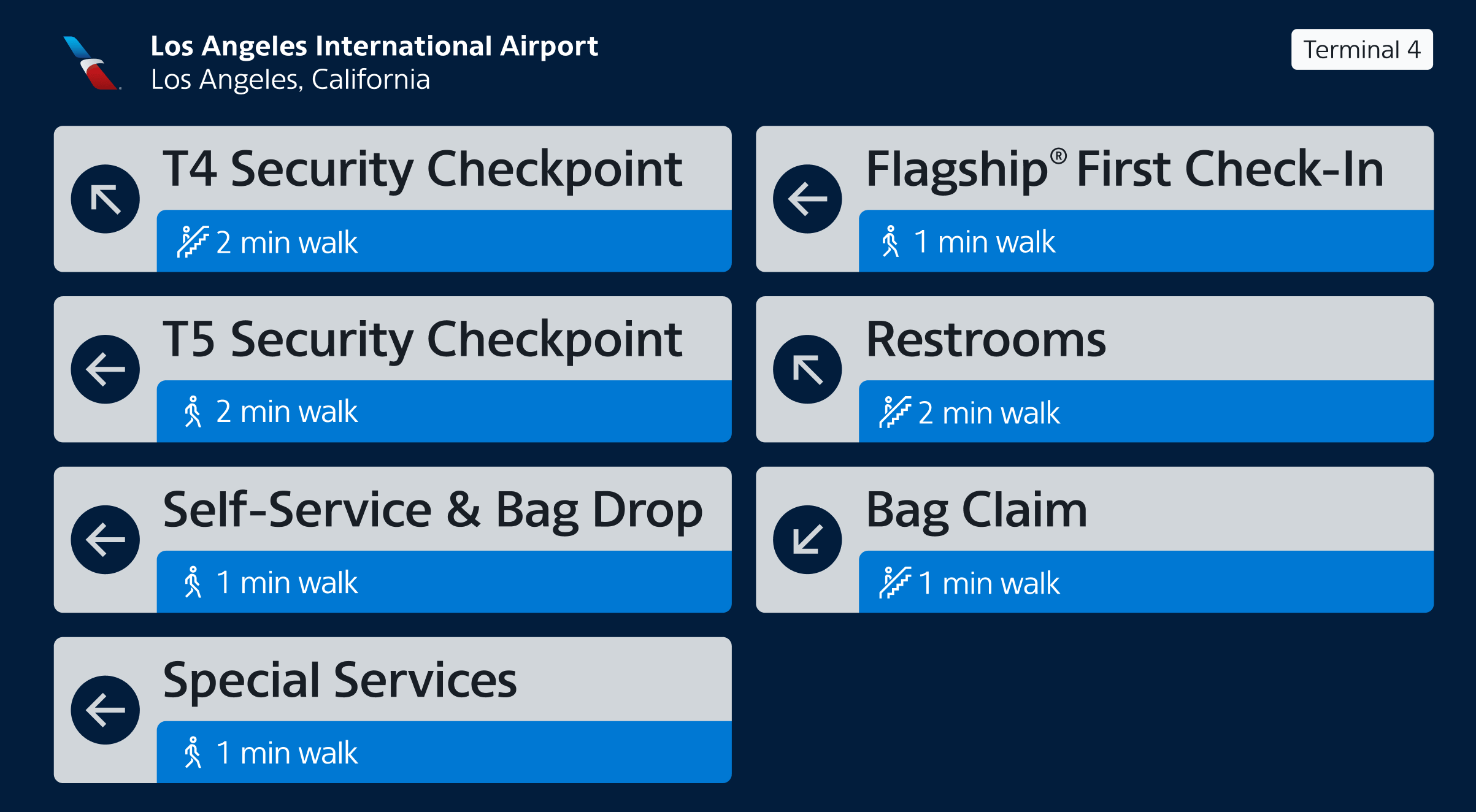
Our goal in the wayfinding was to create clear, concise content for customers to consume and understand. This means understanding the proper sizing for icons, fonts and ensuring that the icons and directional arrows all matches customers mental modesl
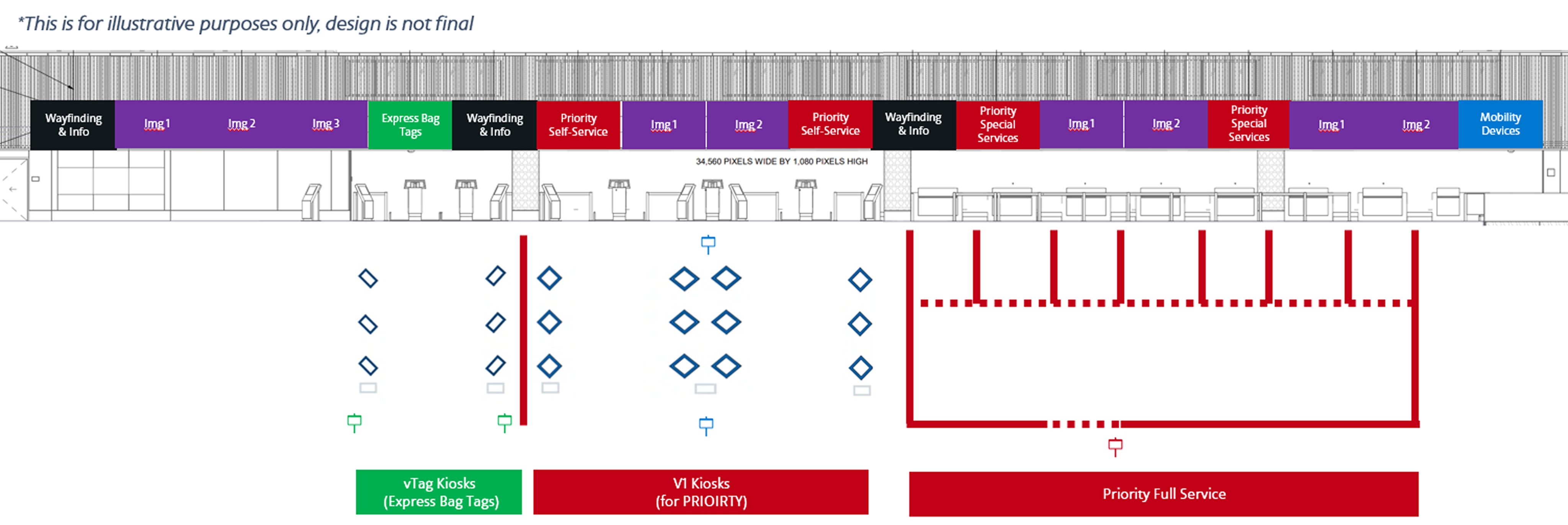
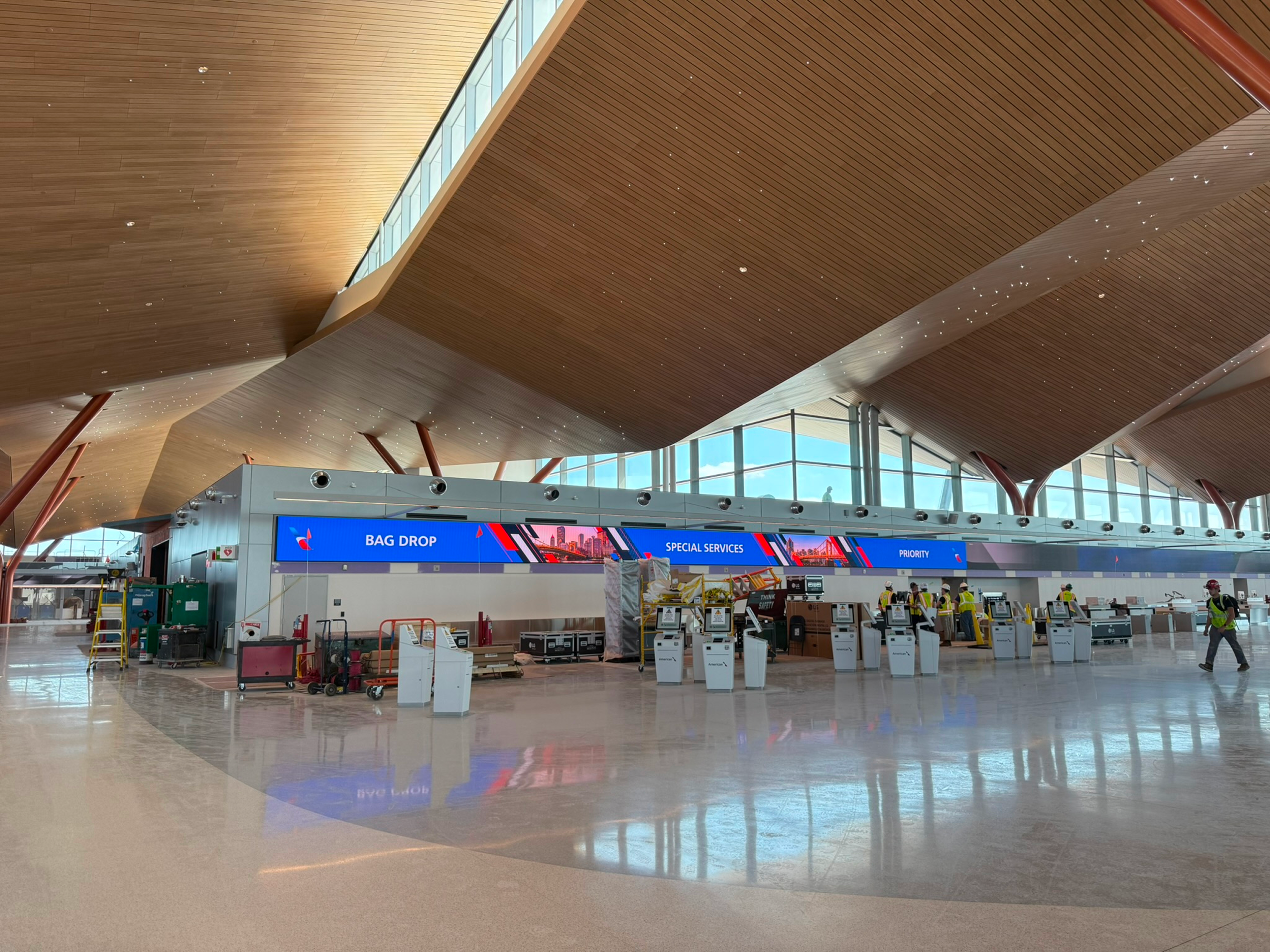
The largest screens we had designed for
This was a different and exciting task. The team has had continued opportunity to step more into the Service Design space due to continual strong delviery and partnerships.
LAX Digital Signage Redesign
Business Objective
Over the years, my team has supported a wide range of airport digital signage and wayfinding needs. This includes everything from gate and baggage displays to the large visual backdrops travelers see the moment they enter the terminal. Unlike traditional digital products, this work sits at the intersection of service design and extreme scalability—we design solutions that must function consistently across dozens of airports, each with its own constraints, layouts, and operating rules.
Because every airport is owned and managed differently, our team faces unique challenges at each location. Yet despite these differences, our mission as a User Experience organization remains the same:
Create a cohesive design system that unifies the traveler journey across every touchpoint digital or physical so the experience feels clear, consistent, and intentional no matter where a customer begins their trip.
LAX Digital Wayfinding
American Airlines is updating and modernizing the digital signs at Los Angeles International Airport (LAX). These signs help travelers find their way, check their bags, and understand where to go in the terminal.
Several things triggered the redesign:
- Construction at LAX caused outdated or incorrect signage.
- New technology required updated designs.
- Improving the traveler experience is a major focus across the company.
Working closely with Airport Operations + LAX + Brand
This work is a true cross‑team effort involving UX Designers, Airport Technology & Digital Signage teams, Airport Operations, and our partners at LAX. Because airport signage sits at the intersection of customer experience, local station needs, and regulatory constraints, no single team can solve it alone.
To redesign LAX’s digital signage, we worked closely with both LAX Airport leadership and our Marketing/Brand team to strike the right balance between local requirements and American’s system‑wide brand identity. LAX had clear operational goals—improving passenger flow, reducing confusion during construction, and simplifying the check‑in experience. At the same time, our Marketing partners ensured that every visual, message, color, and icon aligned with AA’s broader brand guidelines so travelers experience consistency no matter which airport they’re in.
Wayfinding
Our goal in the wayfinding was to create clear, concise content for customers to consume and understand. This means understanding the proper sizing for icons, fonts and ensuring that the icons and directional arrows all matches customers mental modesl
The largest screens we had designed for
This was a different and exciting task. The team has had continued opportunity to step more into the Service Design space due to continual strong delviery and partnerships.
Competitive Analysis
Once we walked through the current construction to understand the space, we also did a competitive analysis while at LAX to understand what other leader int he airline were doing.
LAX Digital Signage Redesign
Business Objective
Over the years, my team has supported a wide range of airport digital signage and wayfinding needs. This includes everything from gate and baggage displays to the large visual backdrops travelers see the moment they enter the terminal. Unlike traditional digital products, this work sits at the intersection of service design and extreme scalability—we design solutions that must function consistently across dozens of airports, each with its own constraints, layouts, and operating rules.
Because every airport is owned and managed differently, our team faces unique challenges at each location. Yet despite these differences, our mission as a User Experience organization remains the same:
Create a cohesive design system that unifies the traveler journey across every touchpoint digital or physical so the experience feels clear, consistent, and intentional no matter where a customer begins their trip.
LAX Digital Wayfinding
American Airlines is updating and modernizing the digital signs at Los Angeles International Airport (LAX). These signs help travelers find their way, check their bags, and understand where to go in the terminal.
Several things triggered the redesign:
- Construction at LAX caused outdated or incorrect signage.
- New technology required updated designs.
- Improving the traveler experience is a major focus across the company.
Competitive Analysis
Once we walked through the current construction to understand the space, we also did a competitive analysis while at LAX to understand what other leader int he airline were doing.
Working closely with Airport Operations + LAX + Brand
This work is a true cross‑team effort involving UX Designers, Airport Technology & Digital Signage teams, Airport Operations, and our partners at LAX. Because airport signage sits at the intersection of customer experience, local station needs, and regulatory constraints, no single team can solve it alone.
To redesign LAX’s digital signage, we worked closely with both LAX Airport leadership and our Marketing/Brand team to strike the right balance between local requirements and American’s system‑wide brand identity. LAX had clear operational goals—improving passenger flow, reducing confusion during construction, and simplifying the check‑in experience. At the same time, our Marketing partners ensured that every visual, message, color, and icon aligned with AA’s broader brand guidelines so travelers experience consistency no matter which airport they’re in.
Wayfinding
Our goal in the wayfinding was to create clear, concise content for customers to consume and understand. This means understanding the proper sizing for icons, fonts and ensuring that the icons and directional arrows all matches customers mental modesl
The largest screens we had designed for
This was a different and exciting task. The team has had continued opportunity to step more into the Service Design space due to continual strong delviery and partnerships.